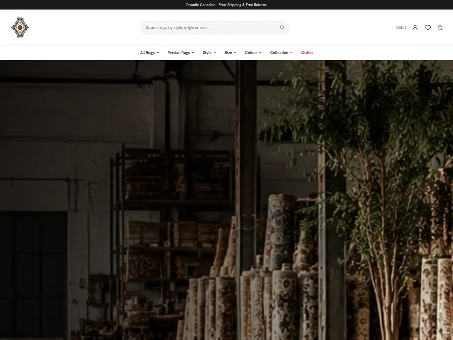
A vast rug collection made browsable by the questions buyers ask.
An elegant catalogue experience built to present distinctive rug collections with clarity and visual depth.
- 6 Catalogue filters
- Auto Rug pages
- 200 KB Mobile image budget
A storefront where a new collection goes live in an afternoon.
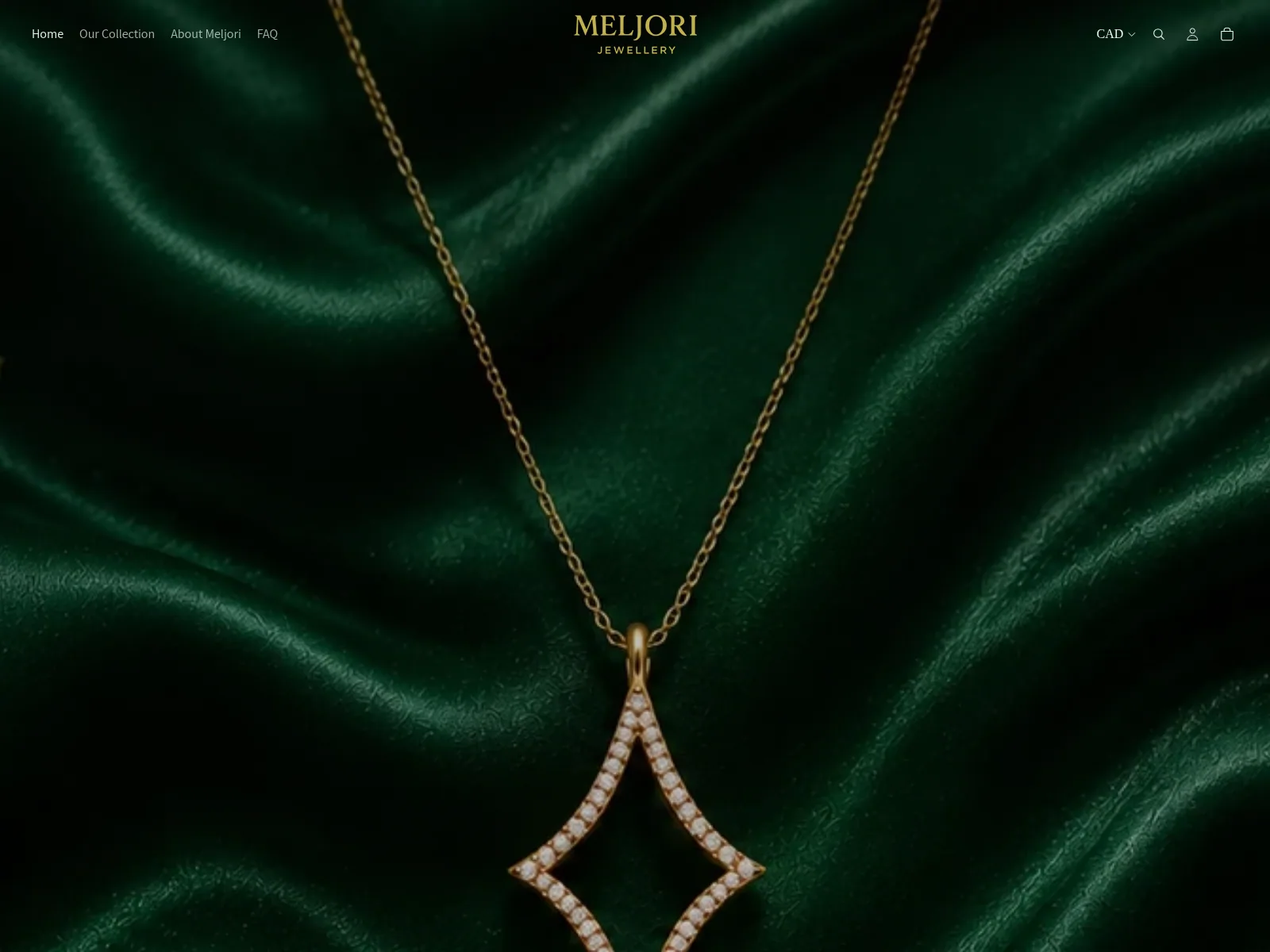
A refined jewellery storefront designed to make product discovery feel considered, premium, and effortless.
from 5 · 60% down
The numbers we were given, where each one started, and what it is measured against.
| Metric | Before | After | Change | Measured against |
|---|---|---|---|---|
| Collections online | — | 14 | — | Each with its own photography-led landing page. |
| Checkout steps | 5 | 2 | 60% lower | Down from five, with cart and payment on one screen. |
| Product page weight | — | 180 KB | — | Optimised imagery, with no layout shift. |
Fine jewellery is sold on feeling, but the old storefront flattened every piece into the same grid. Shoppers could not tell the collections apart, and checkout lost the sense of care the brand had built in person.
We designed the storefront around considered discovery: collection-led photography, generous product pages, and a two-step checkout that keeps the piece in view. Every template is editable by the studio without touching code.
Browsing now feels like a display case rather than a spreadsheet, and a new collection goes live in an afternoon instead of a release cycle.
A vast rug collection made browsable by the questions buyers ask.
An elegant catalogue experience built to present distinctive rug collections with clarity and visual depth.
A catalogue rebuild that lifted conversions 38% in the first quarter.
A high-performing rug catalogue and commerce platform shaped around discovery, trust, and conversion.